
 LOGO IDENTITY FOR AERIAL FUNCTION CENTRE
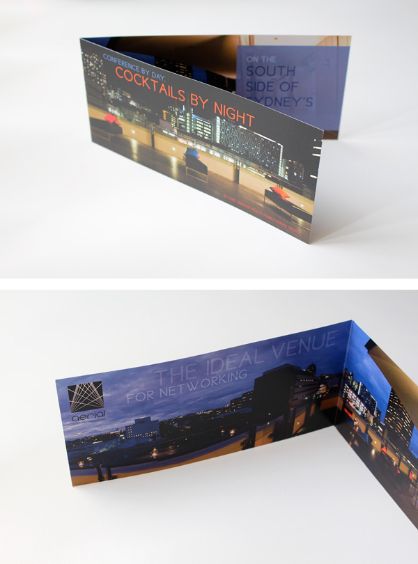
Collateral designed included: stationery, uniforms, brochures, publications, digital communications, print and digital advertisements, expo signage and special promotions for weddings and other events.
Aerial’s name and logo both reference locational landmarks – the iconic aerial situated on top of what was once the old Fairfax newspaper building, as well as the panoramic view of Anzac Bridge on the horizon. In addition, the abstracted aerial/bridge lines intersect to represent crossed paths, ideas and experiences.
Styling, and art direction for the cocktail brochure played on a sophisticated inner city vibe and highlighted Aerial’s best asset: the fantastic twilight view of urban rooftops and skyscrapers from the outdoor bar verandah.