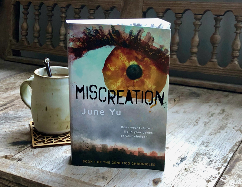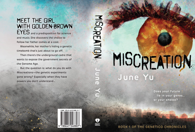
COVER ILLUSTRATION AND BOOK DESIGN FOR MISCREATION?, June Yu’s debut YA science fiction novel. A fast-paced story set in a dystopian future which deals with issues of genetic engineering, classism and prejudice, the environment, and teen relationship angst we can all relate to.
For the cover illustration, I thought back to my old high school biology lessons – learning about basic genetics through eye colour traits. By focusing on the main character’s eye, I referenced several points of conflict in the story – and sorry no spoilers, you’ll just have to read the novel to find out exactly what the high drama is all about!
I painted the eye digitally in a program called Rebelle 3 using a wet watercolour and acrylic effect built up over many layers and with much experimentation. I wanted the eye to look like it had a lot of depth, as if it could almost be at the point of creation of a planet or human embryo. I then used photoshop to incorporate layers of textures into the full cover design – including a snakeskin pattern that I modified to look like a DNA strand melding into some sheet music and grungy splatters. All of these textured details hint at relevant themes in the story.
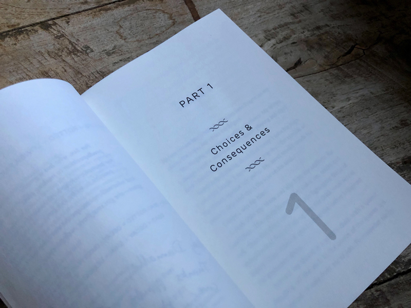
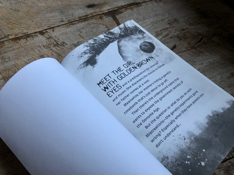
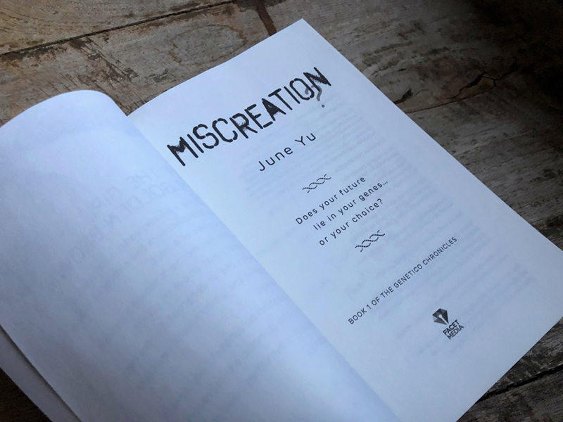
The title typography references urban graffiti from the book, as well as alluding to the rounded broken form of chromosomes. The question mark hangs off the main title as if something is amiss. The interior typesetting has generous leading for legibility and utilises the cover blurb typeface throughout for chapter and sub headings, numbers and headers.
In the course of promoting Miscreation? at the book’s launch and several conferences, June requested a suite of printed marketing materials including postcards, pens, bookmarks, stickers, mugs, and table runners. Artwork for these items was adapted from the cover design to make sure June was fully and consistantly on brand.
Miscreation? is available in both print and ebook and can be purchased directly from June’s own website here as well as through Amazon and Booktopia.
